Guide
How do I read the APX Trading suite?
Public TradingView scripts by crypticcrypto11: Flow, APX Net Vol, Bernoulli Break, Venturi Break, and APX RSI. The paid desk is Discord, education, and the Screener. Starter is $59.99/mo. Pro is $599.99/yr and adds Elite Discord only. Stripe only. No trial. Tools, not signals.
The Screener is the live app for Starter and Pro. Its score is trend, any squeeze or breakout, and RSI. Not a sixth script.
01 · On price · Any — 5m to daily
How do I read APX Flow?
Macro color, micro dots, and the turns — R, T, and B.
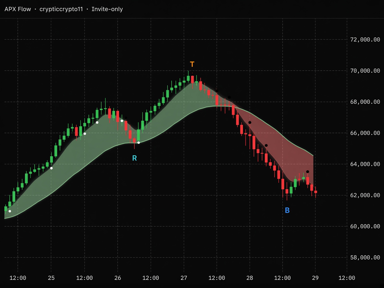
Flow is the powerhouse. It paints the regime on the candles, marks short-term lifts and fades with dots, and calls reversals, tops, and bottoms on the same pane as price. Parameters are locked; you only toggle what you want to see.
How to read it
- Treat green / red bars as the filter. Longs belong on green, shorts on red, unless a shape overrides the bar.
- White dots under the bar = micro lift. Black dots above = micro fade. No dot means the short-term average is flat — skip the noise.
- The trend line and shade are the tape’s slope. Price above a green line wants continuation; a cross under a red line is weakness.
- R, T, and B are the sparse calls. They print on a bar — they only confirm if the following bar or the next bar closes beyond that signal wick. B and bullish R (below the bar) confirm on a close above the wick. T and bearish R (above the bar) confirm on a close below the wick. If neither of those two bars takes the wick, it is not a confirmation. Don’t stack a second oscillator on them unless you want extra filter.
On the chart
- Green barBullish macro — price above the long average
- Red barBearish macro — price below the long average
- White dotBullish micro, under the bar
- Black dotBearish micro, above the bar
- R cyanBullish reversal, below the bar. Confirms if the following bar or the next bar closes above the signal wick.
- R yellowBearish reversal, above the bar. Confirms if the following bar or the next bar closes below the signal wick.
- T orangeLocal top, above the bar. Confirms if the following bar or the next bar closes below the signal wick.
- B blueLocal bottom, below the bar. Confirms if the following bar or the next bar closes above the signal wick.
Settings
Double-click the name in the legend. Everything else is locked.
Show Reversals default On
Cyan / yellow R shapes on trend shifts. Still wait for the following bar or the next bar to close vs the wick.
Show Tops default On
Orange T on local tops. Confirms if the following bar or the next bar closes below the wick.
Show Bottoms default On
Blue B on local bottoms. Confirms if the following bar or the next bar closes above the wick.
Show Trend default On
Flow line and the green / red shade.
Alerts
Right-click the chart → Add alert → pick the condition. Prefer bar close.
- Local Top Posted
- Local Bottom Posted
- Bull Reversal Posted
- Bear Reversal Posted
- Bullish / Bearish Micro Dot Posted
- Bullish / Bearish Macro Bar Posted
How to use it
- Scalps: watch micro dots and R on 5–15m. Wait for the following bar or the next bar to close beyond the signal wick before you treat R as live.
- Swings: trust the macro color and T / B on the daily — same rule, following or next close vs the wick.
- Never fade a green macro on a white dot without a confirmed T or bearish R.
APX Net Vol in its own pane. Bernoulli or Venturi for the break. RSI to keep T/B honest.
Open APX Flow →02 · Own pane · Under price
How do I read APX Net Vol?
Net Vol shows who's in control: buyers or sellers, on a −100% to +100% scale.
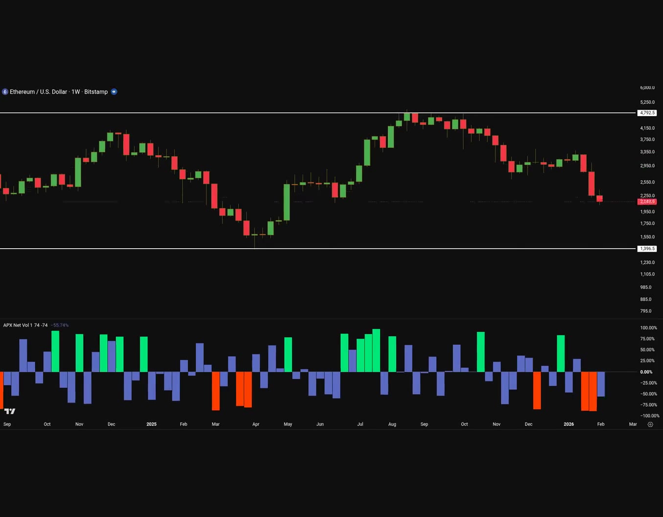
Net Vol turns each bar's buying and selling into one histogram. Blue bars show normal pressure. A green or orange-red bar marks an extreme, where one side is overwhelming the other, and that's often where turns begin.
How to read it
- The histogram is net volume as a percentage from −100% to +100% around a zero line.
- Blue bars show normal pressure.
- A green bar marks a buying extreme, where buyers are overwhelming sellers.
- An orange-red bar marks a selling extreme, where sellers are overwhelming buyers.
- An extreme is often where turns begin.
- It plots in its own pane under price.
In its pane
- Blue barNormal pressure
- Green barBuying extreme
- Orange-red barSelling extreme
- Zero lineThe middle of the −100% to +100% scale
How to add it
Open TradingView. Go to Indicators, then search crypticcrypto11 or APX Net Vol, or open Cryptic’s profile. Add the script. It plots in its own pane under price.
How to use it
- Read the histogram in its own pane under price, on the −100% to +100% scale.
- Blue is normal pressure. Green or orange-red is an extreme, and that's often where turns begin.
- It does not place the trade. Flow is bias on price. Bernoulli or Venturi is the break. RSI confirms.
Flow on price for bias. Bernoulli or Venturi on price for the break — pick the timeframe. RSI in its pane. Net Vol stays in its own pane under price.
Open APX Net Vol →03 · On price · Daily, weekly, monthly
How do I read APX Bernoulli Break?
Higher-timeframe squeeze, then the break.
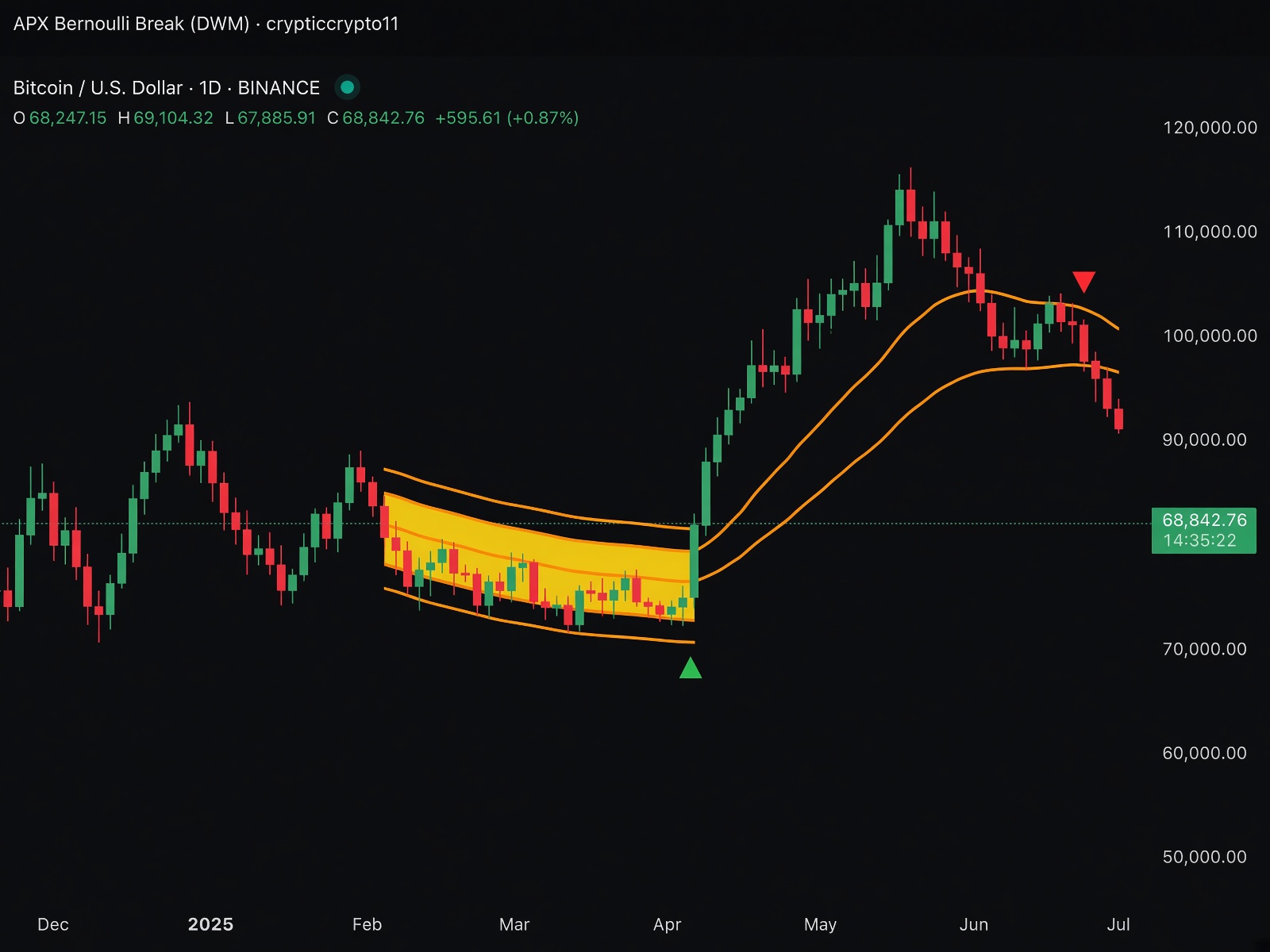
Bernoulli watches volatility compress into orange bands and yellow fill, then marks the release — green up-triangles, red down-triangles. Built for the swing, not the tick. Stricter than Venturi, so the arrows mean more.
How to read it
- Yellow box + orange bands = compression is building. That is the setup, not the trade.
- Green triangle under the bar = close above the upper band after a squeeze. Look long with Flow green.
- Red triangle above the bar = close below the lower band after a squeeze. Look short with Flow red.
- No box, no arrows: stay out. The script hides itself outside squeezes on purpose.
On the chart
- Orange bandsSqueeze is on
- Yellow fillCompression — wait for the break
- Green ▲Bullish break of the upper band
- Red ▼Bearish break of the lower band
Settings
Double-click the name in the legend. Everything else is locked.
Show Squeeze default On
Orange bands and yellow fill while compressed.
Show Breakout Arrows default On
Green / red triangles on the break.
Alerts
Right-click the chart → Add alert → pick the condition. Prefer bar close.
- Volatility Squeeze Detected
- Bullish Breakout
- Bearish Breakout
How to use it
- This is the higher-timeframe call. Daily / weekly / monthly only if you want it as designed.
- Don’t scalp Bernoulli arrows on a 2-minute chart — that’s Venturi’s job.
- A daily squeeze plus a minute Venturi arrow is the multi-timeframe stack.
Venturi for the entry once Bernoulli has the squeeze. Flow for direction. APX Net Vol in its own pane. RSI to skip breaks at 70 / 30.
Open APX Bernoulli Break →04 · On price · 1-minute to 1-hour
How do I read APX Venturi Break?
The same squeeze, on the minute.
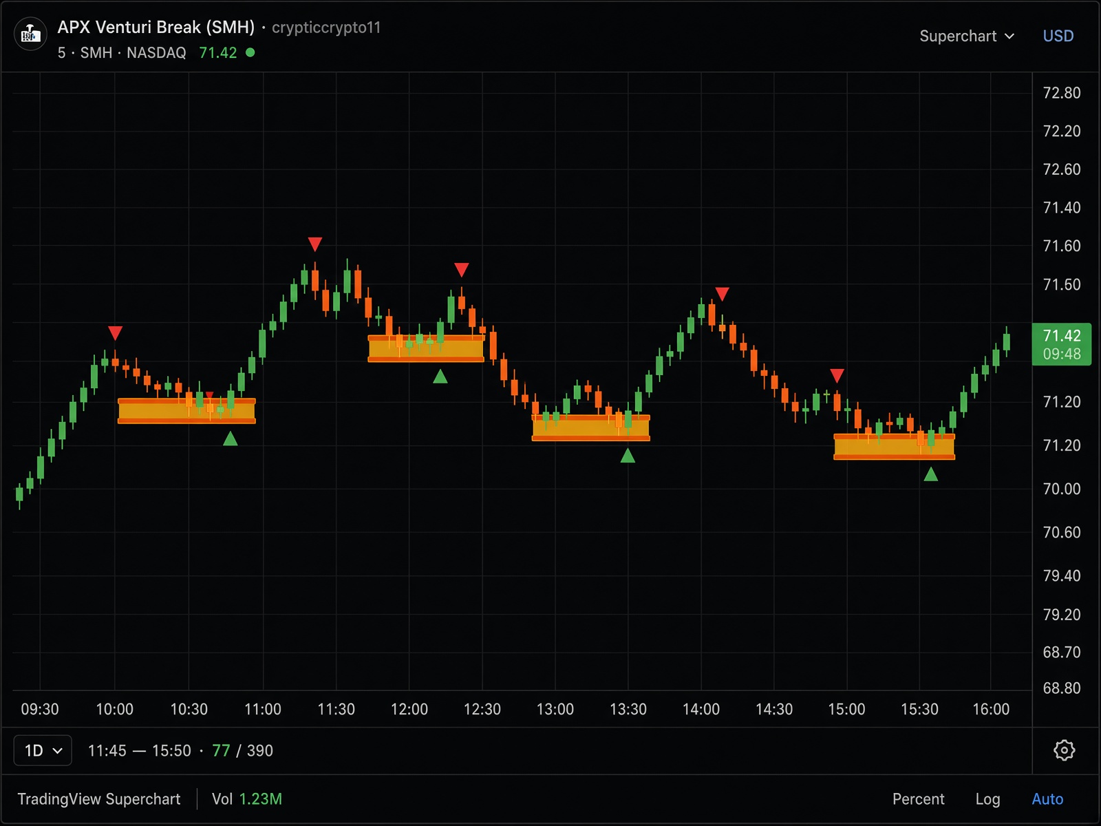
Venturi is Bernoulli’s intraday twin. Same orange bands, yellow fill, green / red triangles — with looser thresholds so a 2-minute tape doesn’t inherit a weekly rule. More signals. Filter them.
How to read it
- Yellow fill on a 5-minute chart is the coil. Get ready; don’t chase yet.
- Green ▲ after the squeeze = long candidate, especially if Flow is green.
- Red ▼ = short candidate under a red Flow bar.
- Hourly Venturi starts to look like Bernoulli. Below 15m, expect more arrows — confirm with volume or the close.
On the chart
- Orange bandsIntraday squeeze
- Yellow fillCoil — break incoming
- Green ▲Upper-band break, long bias
- Red ▼Lower-band break, short bias
Settings
Double-click the name in the legend. Everything else is locked.
Alerts
Right-click the chart → Add alert → pick the condition. Prefer bar close.
- Volatility Squeeze Detected
- Bullish Breakout
- Bearish Breakout
How to use it
- Day-trade: 1–15m, arrows in the Flow color, tight stops outside the bands.
- Don’t run Venturi on daily / weekly — switch to Bernoulli.
- Skip arrows when RSI is already through 70 or 30.
Bernoulli on D/W for the map. Flow for the color. APX Net Vol in its own pane. RSI confirms.
Open APX Venturi Break →05 · Lower pane · Any
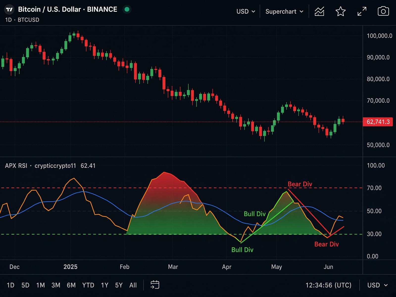
How do I read APX RSI?
Orange RSI, blue average, labeled divergences.
A momentum pane, not an overlay. Orange RSI, blue average, red 70 and green 30, zone tint at the extremes, and four kinds of divergence drawn on the oscillator. Regular = reversal. Hidden = continuation.
How to read it
- Orange above 70 = overbought. Orange below 30 = oversold. The red / green fill is the shout.
- Blue average is the slope of momentum. Orange crossing blue is a shift.
- Solid lines: regular divergences. Price higher-high + RSI lower-high = Bear Div. Price lower-low + RSI higher-low = Bull Div.
- Dashed lines: hidden. Hidden Bear = uptrend that may keep going. Hidden Bull = downtrend that may keep going. Treat hidden as continuation, not a flip.
On the chart
- Orange lineRSI
- Blue lineRSI average
- Dashed 70Overbought
- Dashed 30Oversold
- Bear DivSolid red — regular bearish
- Bull DivSolid green — regular bullish
Settings
Double-click the name in the legend. Everything else is locked.
Show Bull Div default On
Solid green regular bullish divergence.
Show Bear Div default On
Solid red regular bearish divergence.
Show Hidden Bull default On
Dashed green hidden bullish.
Show Hidden Bear default On
Dashed red hidden bearish.
Alerts
Right-click the chart → Add alert → pick the condition. Prefer bar close.
- Bearish / Hidden Bearish Divergence
- Bullish / Hidden Bullish Divergence
- RSI Crossed Above 70
- RSI Crossed Below 30
How to use it
- Mean-revert: oversold + Bull Div, with Flow not screaming red.
- Trend: Hidden Bull in a green Flow tape; Hidden Bear in red.
- Check RSI: no Bernoulli / Venturi longs when RSI is already through 70.
Flow T/B should agree with regular divergences. APX Net Vol sits in its own pane. Squeeze tools should not fire into an extreme.
Open APX RSI →Scripts are free on TradingView (crypticcrypto11). Starter is $59.99/mo. Pro is $599.99/yr and adds Elite Discord only. Paid desk: Discord, education, and the Screener. Stripe. Full install: https://apxtrading.io/install
How to read the suite · Install · Compare · Pricing